


the No1 Google Ranking Luxury Property Magazine
Why Choosing Art Is An Art Form
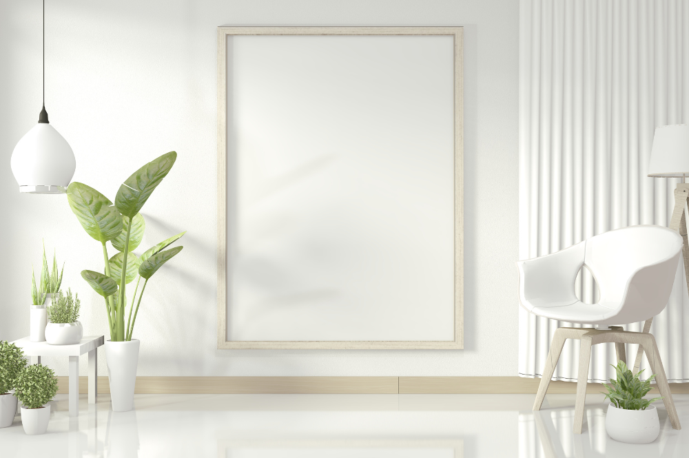
24.06.22Selecting, grouping and hanging art takes a great eye. Be it different sizes, colours, frames and subject matter hung salon-style, or a strategically placed gallery collection that acts as a room’s focal point, art should enhance the interior architecture and furniture.
Just as other components in a room are chosen to create balance within the overall space, so is art. It should honour elements already in the space, build on them, fill in gaps, and provide an additional layer of intrigue, so the final product exudes cohesion and a sense of equilibrium.
Highlight a Common Theme
There’s no formula for building a perfect gallery wall, but it’s helpful to keep to a consistent element. A lot of people who do a gallery wall often have a collection - whether it’s family photos, oils or landscape scenes. Your edit should have a story or a throughline. For example, if you have a group of antique oils and they have similar framing, it brings it together even if the paintings are all different.
The background colour on the wall is important too. A neutral scheme allows the paintings to pop, but recently, people are embracing deeper, richer colours - everything from black and navy to terracotta, which creates interest in the photos.
Play With Shape, Size and Orientation
Start with a colour palette and work each piece into that overall scheme. Play with a blend of shapes and sizes and a healthy mix of landscape and horizontal. Filter everything through that scheme, so it feels cohesive even if the pieces are different from one another. Maybe start with the largest piece of art as a focal point and build from there.
Don’t forget to make it personal and try to incorporate any mementos of your own. It can easily feel a bit chaotic with so many ideas, so outline what you want to hang and always revert to the initial colour palette.
When in Doubt - Go Big
A rule of thumb is to choose artwork that you love. What is beautiful and moving isn’t the same across the board. When the goal is to really fill a wall, going oversized for artwork is impactful. If the grouping is too small, it doesn’t feel purposeful. When in doubt, go big.
In larger groupings, aiming to fill up about two-thirds of the wall is a good rule of thumb. If the artwork or photography itself isn’t large enough to fill the wall, matting can make a difference, as can the size of the frame. Creating negative space by matting smaller artwork in a large frame can be visually stunning.

Categories
Property Of The Week
-
 Property Of The Week: The Iconic ‘Doll House’ Of Harbour Island, Bahamas
22.06.26
Property Of The Week: The Iconic ‘Doll House’ Of Harbour Island, Bahamas
22.06.26
- Property Of The Week: Villa Jardin, Le Provençal, French Riviera 10.06.26
- Property Of The Week: Studio Indigo’s Belgravia Mews Reveal 03.06.26


Abode Affiliates


COPYRIGHT © Abode2 2012-2026
