


the No1 Google Ranking Luxury Property Magazine
Pantone Colour of the Year 2022
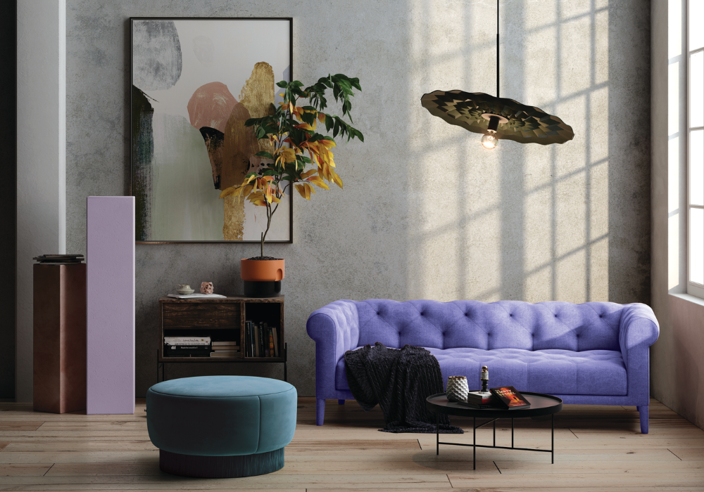
31.12.21Pantone have released the Colour of the Year 2022: Very Peri 17-3938. Abode2 teams up with Jetclass to find how to be on the 2022 trend through luxury and glamourous pieces of furniture
“A dynamic periwinkle blue hue with a vivifying violet red undertone blends the faithfulness and constancy of blue with the energy and excitement of red.”
A warm and friendly blue hue with a carefree confidence and joyful attitude emboldens uninhibited expression and experimentation. This enthusiastic tone displays a dynamic presence and a whimsicality that lends itself to unpredictable colour harmonies and spontaneous colour statements.

Displaying a carefree confidence and a daring curiosity that animates our creative spirit, inquisitive and intriguing PANTONE 17-3938 Very Peri helps us to embrace this altered landscape of possibilities, opening us up to a new vision as we rewrite our lives. Rekindling gratitude for some of the qualities that blue represents complemented by a new perspective that resonates today, PANTONE 17-3938 Very Peri places the future ahead in a new light.
We are living in transformative times. PANTONE 17-3938 Very Peri is a symbol of the global zeitgeist of the moment and the transition we are going through. As we emerge from an intense period of isolation, our notions and standards are changing, and our physical and digital lives have merged in new ways. Digital design helps us to stretch the limits of reality, opening the door to a dynamic virtual world where we can explore and create new colour possibilities. With trends in gaming, the expanding popularity of the metaverse and rising artistic community in the digital space PANTONE 17-3938 Very Peri illustrates the fusion of modern life and how colour trends in the digital world are being manifested in the physical world and vice versa.

Laurie Pressman, Vice President of the Pantone Color Institute, explains: “The Pantone Color of the Year reflects what is taking place in our global culture, expressing what people are looking for that colour can hope to answer. Creating a new colour for the first time in the history of our Pantone Color of the Year educational colour program reflects the global innovation and transformation taking place. As society continues to recognise colour as a critical form of communication, and a way to express and affect ideas and emotions and engage and connect, the complexity of this new red violet infused blue hue highlights the expansive possibilities that lay before us”.
Encompassing the qualities of the blues, yet at the same time possessing a violet-red undertone, PANTONE 17-3938 Very Peri displays a spritely, joyous attitude and dynamic presence that encourages courageous creativity and imaginative expression.


Grace Chair & Beatrice Dressing Table


Categories
Property Of The Week
-
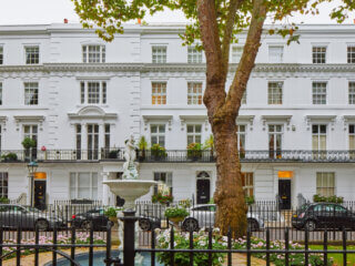
 Property Of The Week: Live Like 007 In This Iconic Chelsea Townhouse
09.07.25
Property Of The Week: Live Like 007 In This Iconic Chelsea Townhouse
09.07.25
- Property Of The Week: Ex-Embassy Mayfair Mansion Sold To Ultra-Wealthy Buyer 09.07.25
- Property Of The Week: A Dream Country House On The Scottish Borders 07.07.25


Abode Affiliates


COPYRIGHT © Abode2 2012-2025
