


the No1 Google Ranking Luxury Property Magazine
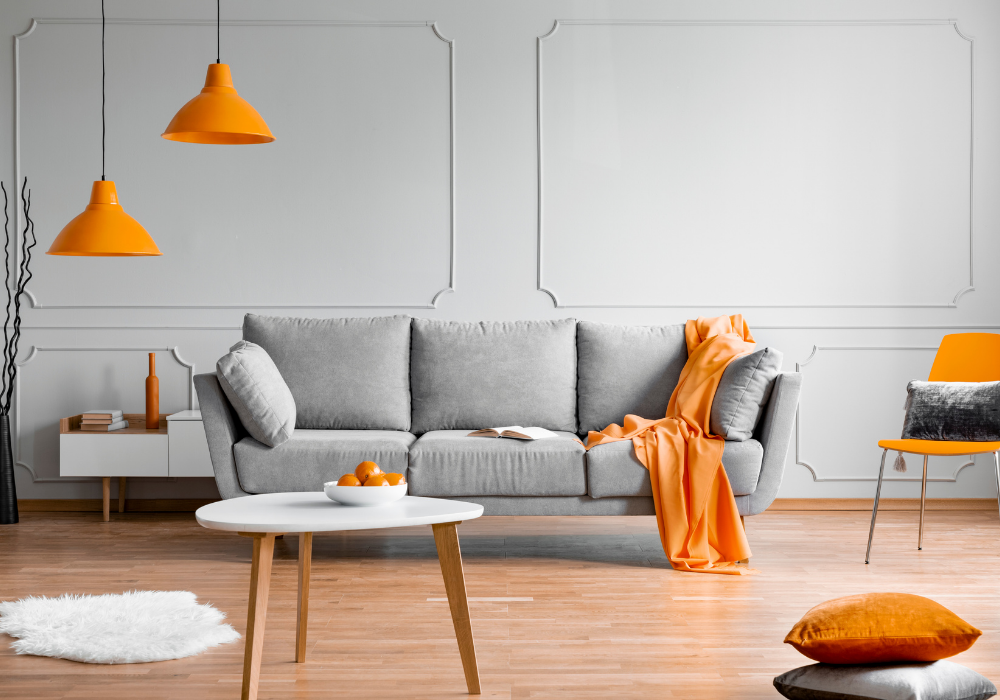
Orange Is The Go-To Colour For 2022
13.01.22If we can’t travel the world easily right now, travel can come to us – in the form of a warm, playful colour palette to brighten up our homes, reports Abode2 luxury property magazine.
Pantone Orange Ochre is the leading colour trend shared by the Pantone Colour Institute this year, setting the scene for a vibrant, feel-good hue that defies the gloom of a British winter.
From rich papaya orange to subtler cantaloupe shades, this is a tone with versatility on its side – which means you can use it to experiment with a range of design ideas. Colour-block walls, statement furniture or the odd flourish against a neutral backdrop are all ways to work the look. A pop of apricot or melon will also look beautiful against plant-inspired interiors.
Above all, this is a design trend that’s all about freedom and expressiveness. Fun-loving orange doesn’t take itself too seriously. Instead, it’s about bringing a dash of adventure and escapism to lacklustre settings, with sunny vibes to spark joy through endless winter days.

Categories
Property Of The Week
-
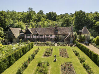 Property Of The Week: Historic Kent Country House On The Market For £3.9M
06.07.26
Property Of The Week: Historic Kent Country House On The Market For £3.9M
06.07.26
- Property Of The Week: The $100M Brazilian Private Island & Home Inspired By Cinema 01.07.26
- Property Of The Week: The Iconic ‘Doll House’ Of Harbour Island, Bahamas 22.06.26


Abode Affiliates


COPYRIGHT © Abode2 2012-2026
